This entry was posted on Thursday, August 16th, 2012 at 12:16 pm and is filed under Important Announcements. You can follow any responses to this entry through the RSS 2.0 feed. You can leave a response, or trackback from your own site.
16.08.2012 Post in Important Announcements
Forex is measured through charts. It is a virtual representation that reflects the price movement of a quotation within a specific time. There are 2 coordinates that makes up a chart – Price and Time.
The price is shown on the vertical Y- axis while the time is shown in the horizontal X- axis.
The time which is broken down to different time frames may be viewed depending on the trader. The available time frames are usually: 1 month (MN), 1 week (W1), 1 day (D1), 4 hours (H4), 1 hour (H1), 30 minutes (M30), 15 minutes (M15), 5 minutes (M5), 1 minutes (M1), and an individual quoting tick or simply tick which materializes through the form of Bid and Ask.
The time frames are composed of 4 components: Open, Close, High Low
Open – the market price that is formed when the trading period starts.
Close – the market price which is given at the end of the trading period.
High – the highest price that is achieved within the trading period.
Low – the lowest price that was achieved within the trading period.
Chart Types:
Tick Chart – shows the tick movement of a specific currency pair without a specific time frame. It reflects the individual quotes of Bid and Ask prices given by market-maker and is often used to determine the support and resistance level.
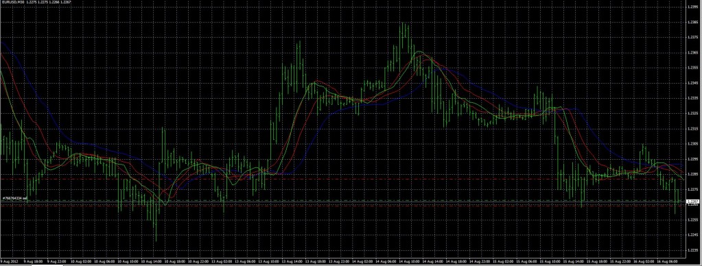
Line Chart – it may be easily distinguished through its simple form – Line. Line charts are plotted with the closing price that gives an easier view on technical analysis patterns. But this chart has a downside. The lack of some information, due to the fact that the closing price is reflected in the chart, hinders traders from evaluating the rise and fall of the price within the period.

Bar Chart – are composed of stalk like vertical lines which has a small horizontal line on both sides. The upper end of the stalk is the maximum price achieved within the period. While the lower end of the stalk shows the minimum price within the period. The horizontal line on the left shows the opening price while the right horizontal line is for the closing price. The analysis with the help of this chart is a bit tricky. You have to consider the right line as the open price and the left line as the closing; if the left line is higher than its counterpart then the price has decreased within the period; and vice versa.

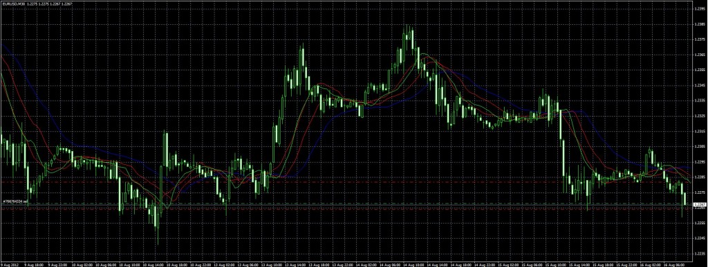
Japanese candlesticks – it is the most famous chart and also has the same composition with the bar chart. The only difference is that it is more comfortable to look at when compared to the bar chart. Each candlestick has the same composition with the bar chart’s stalks.
The candlestick has 2 parts; the real body, and the shadow. The real body is depicted by a a vertically inclined rectangle which reflects the opening and closing price of the trading period. If the body is highlighted then it is called a solid real body which means that the closing price is lower than the opening price. A hollow or transparent body signifies that the closing price was higher than the opening.
The shadow depicts the minimum and maximum value achieved within the time period. The upper shadow located at the top of the candlestick shows the maximum value while the lower shadow located at the bottom of the candlestick shows the minimum value.

Stephen Stevenson


